Dear readers,
You can find our December 2008 issue on newsstands now.
I am proud of this issue for many reasons, just as I am proud of every issue for many reasons, but I want to focus on the December issue's
cover. Next to President-elect Obama on the October 30th issue of
Rolling Stone and Megan Fox on the October 2008 issue of
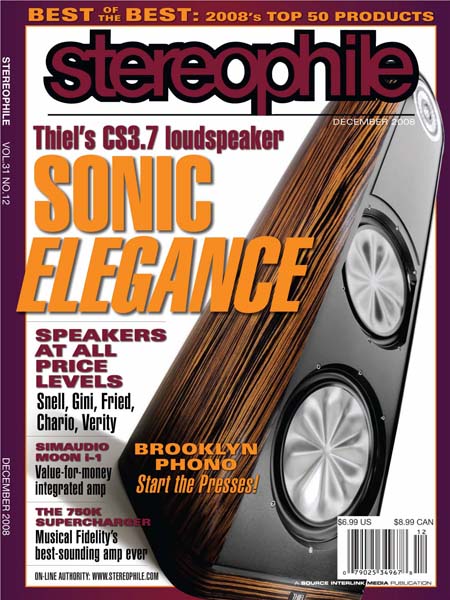
GQ, it is my favorite cover of the year. We saved the best for last, I feel. I love the color combination; it never would have occurred to me to match orange with this particular shade of purple, but I think it works very well—it is vibrant, striking, and does a great job of complementing the composite ebony finish of the lovely Thiel CS3.7 speaker.
A lot of thought and work goes into each cover we produce. John Atkinson decides which component featured in the issue will grace the front page. JA often consults our reviewers. A product which has sparked the enthusiasm of our reviewers obviously stands a much better chance of making the cover. Of course, the product should also be
important. It should offer outstanding value (the
PSB Synchrony One of our April 2008 cover), reflect a market trend (the
Rega P3-24 of our July 2008 cover), look toward the future (the
Sooloos music server system of our September 2008 cover), achieve new levels of performance (the
Revel Ultima Salon2 of our June 2008 cover). After we decide on a product, I notify the lucky manufacturer and work with a company representative to have the component shipped to our cover photographer, Eric Swanson, in Santa Fe, New Mexico.
(The manufacturer is
usually delighted. You'd be surprised.)
I wish Eric was closer, but only because he is such a joy to work with. With the exception of the few covers featuring odd illustrations and a few others created immediately after
Stereophile moved from Santa Fe to New York City, Eric has been responsible for the cover photography of every issue since Vol.17 No.1 (January 1994), when we changed our trim size from 5.5" by 8.43" to the current 7.5" by 10.25". Hey, that's 15 years of service. Happy Anniversary, Eric!
Eric's dedication, his understanding of our objectives, his keen eye, and his uncanny ability to impart upon cold, silver rectangles the warm pulse of life are blessings to the look, feel, allure, and overall value of our dear book.
I work with Eric to schedule a shoot date; discuss potential finish options with the manufacturer, with Eric, and with our art director, Natalie Baca; assist with any logistic concerns. The product arrives safely and on time (usually); Eric and his assistant, Jenna Gersbach, construct a staggeringly intricate arrangement of spotlights and backdrops; get the shot; immediately send us a couple of digital proofs. We tell Eric that the shot looks awesome, and he moves forward with the feature shot which accompanies the actual review. Freed from the confines of the cover and its goals, Eric has a bit more room to be creative with the feature shot. Once both shots are complete, Eric and Jenna pack up the gear, and I arrange with the manufacturer to place a return pickup.
When we have a solid idea of all that will be featured in the issue, John Atkinson writes the text that scrolls across and around the cover image, the
cover copy. We send the cover copy to Natalie Baca and she treats it, gives it a personality of color and font style and size, and places it onto the image. Natalie constructs several options from which to choose, each with different image and text placement and color variations. John and I select our favorite(s) and pass them along to our group publisher, Rob MacDonald; publisher, Keith Pray; director of single copy marketing, Brian Daley; and senior product manager of single copy sales, Dylan Beadle. John Atkinson weighs any suggestions and comments, and we revise the cover accordingly. Finally, the cover is done.
I think we have surpassed our work of recent years in creating attractive, significant, arresting covers—covers that will compel a casual shopper to reach for our magazine among all others on a newsstand, flip through its pages, and carry it home, covers that will make a longtime subscriber proud.
Do you feel the same?
This is what I'm wondering: Do you have a favorite cover of the year? Of recent years? Do you like our choice of colors? Of fonts? Do you think the size of the cover copy font should be larger or smaller? Do you think there should be more or less cover copy? Do you like the borders we've used since Vol.30 No.11 (November 2007) or should we revert to no border? Do you like the white backgrounds we've primarily employed since Vol.27 No.2 (February 2004) or should we revert to alternating colored backgrounds? Is there a type of component you'd like to see featured more often? (For the record, Volume 31 saw six loudspeakers, three music servers, two amplification components, and one turntable.) Would you like to see something entirely different on our covers (people, places, illustrations, album covers)?
Anything else?
Please let me know. Curiously,
Stephen
PS
To provide some inspiration, or just for fun, I've scanned and posted some older covers that have, for one reason or another, caught my attention:
Vol.17 No.2 (February 1994)
Vol.17 No.10 (October 1994)
Vol.19 No.3 (March 1996)
Vol.20 No.9 (September 1997)
Vol.22 No.12 (December 1999)
Vol.27 No.1 (January 2004)