| Columns Retired Columns & Blogs |
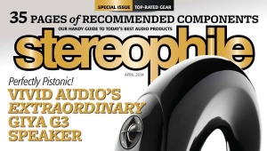
Def cream. I remember seeing the September issue come in and think: "Enough with the bold cover pages, let's have some variety!" I did like June's green border with the Klipsch, though.

Which version do you prefer?

Posted Mon Aug17,2009, 3:30 PM — By johnnyturbo...." those speakers are either totemic and/or a phallic symbol."..... Don't know whose appendage you base the phallic idea on but If it's yourself I'd be off to a good surgeon fast.The cream cover is superb . The choice of typeface,and type color too. Who talked you into that nasty yellow SM?
hi- i am making a symbolic interpretation. the speaker so aggressively dominates the cover and demands attention. to paraphrase the old line, "...sometimes a cigar is only a cigar"; sometimes a speaker is not only a speaker. the unconscious is a powerful piece of the mind.glad the comment sparked your interest.best,JT
I find it funny that a guy who clearly has an issue with marketing and all its "perceived value" as opposed to the honestly over priced "Authentic value" his speakers represent is on your cover. I personally have issues with this way over priced product line. I can't find anything in the parts list that even remotely justifies the cost of these speakers. Perhaps Dave should charge an honest authentic price and sell the Ferrari that he owns as a result of his excessive price gouging. Granted marketing says that you should charge what the market will bear and since he is getting it perhaps Dave believes in marketing after all--perhaps maybe a little too much.As far as your covers are concerned, photography and digital manipulation of images have come a long way but I can't say that any products on your covers exhibit any advanced styling. They are a fair representations of the products exactly as they would appear in real life. Chose a border that makes your magazine pop on t
| Loudspeakers Amplification Digital Sources | Analog Sources Accessories Featured | Music Columns Retired Columns | Show Reports | Features Latest News Community | Resources Subscriptions |
 © 2024 Stereophile