| Columns Retired Columns & Blogs |
Says, "polio stricken wicker basket of Victorian potpourri."
So while it's utterly inappropriate for a high tech device like the Sony product in question, it kind of works.

In a related review, John Atkinson spends some serious time with NAD's "Masters Series" combination of M50 Digital Music Player, M51 D/A processor, and M52 RAID array Media Store. Yes, this exquisitely engineered system sounded superb with hi-rez digital files but even gave musical pleasure from sonically compromised Internet radio streams. "If you're looking for a 21st-century digital audio source and don't want to have too close a relationship with your computer, NAD's Masters Series will be all you need," he concluded.
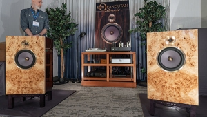
Other products reviewed in this month's issue include: American-made tube amplifiers at both ends of the price spectrum from VTL and Raven, while in "Sam's Space," Sam Tellig takes second listens to the controversial Croft Phono Integrated amplifier and KEF's superb little LS50 loudspeaker. In "Analog Corner," Mikey Fremer kicks off a two-part review of VPI's new Classic Direct turntable—the New Jersey company's first direct-drive design. "The Entry Level" sees Stephen Mejias returning to analog music with Ortofon's Ortofon 2M Red phono cartridge, the latest version of VPI's Traveler turntable, phono preamps from Lehmann Audio and Bozak Madisson (affordable and very affordable respectively) and Music Hall's Mooo Mat platter mat, made from a hunk of cowhide. In the latest installment of "Music in the Round," Kal Rubinson checks out Krell's Foundation preamplifier/processor and experiments with the sophisticated Dirac room correction system, while Art Dudley steps up the output of his EMT moving-coil cartridge with the latest transformer from Bob's Devices.
And there's plenty of music coverage. David Lander reviews Stanley Crouch's book on alto sax legend Charlie Parker, and music editor Robert Baird interviews supreme jazz violinist Regina Carter and Norwegian bass player Arild Anderse, whose new album on ECM was a contender of this issue's "Recording of the Month." But the May accolade goes to the superb second album from trumpet player Ambrose Akinmusire, the intriguingly titled The Imagined Savior is Far Easier to Paint. (Fred Kaplan also enthused about his album in his blog.) "A force to ignore at your own risk," sez reviewer Robert Baird.
At the very start of this issue, Steve Guttenberg declares "Here's what I've learned in my 35 years in the High End, first as a hi-fi salesman and then as a full-time reviewer and blogger: No hi-fi, no matter how expensive or exalted, will ever deliver the holy grail."
Thank you for reading Stereophile. We hope you enjoy the issue in your search for your own musical grail.

Says, "polio stricken wicker basket of Victorian potpourri."
So while it's utterly inappropriate for a high tech device like the Sony product in question, it kind of works.

while it's utterly inappropriate for a high tech device like the Sony product in question, it kind of works.
It's a close match to the typeface used for the metadata of Herbie Hancock's "Watermelon Man," shown on the Sony's display.
John Atkinson
Editor, Stereophile
Thanks for pointing that out.
The two typefaces are roughly 100 years apart in what they reference - the other one I'd say is "late 20th Century ufo conference flyer." It is common, as you probably know, to first associate type with architectural styles - two of the easiest to grasp examples of corrolaries in this vein being Gothic architecture and type and Art Deco architecture and type.
I assume the type is chosen by an in house person; it seem SM sometimes posts about cover designs.... Manhattan has a wealth of resources, and I wonder if someone like Robert Wakeman, as a very good example, wouldn't be tickled pink by a cold call from a (relatively) young person from a semi technical, niche magazine to discuss some covers or type generally over lunch.
Or a class at Parson's or a lecture via the Art Directors Club followed by a book on typography, etc.
It's all about personality on the page (or sign or whatever.) Wish I knew more about the subject....
Mike did an excellent job as usual on the review of the New VPI Direct Drive turntable. To add a little clarification, the speed regulation of the direct drive is like hundreds of gentle puffs of air rotating a pinwheel.


| Loudspeakers Amplification Digital Sources | Analog Sources Accessories Featured | Music Columns Retired Columns | Show Reports | Features Latest News Community | Resources Subscriptions |
 © 2024 Stereophile